

basically this pose for her shoulders and head and stuff
http://static.gamesr...ticle_image.jpg
Toggle shoutbox
Shoutbox

|
|||||||||||||||||||||||||||||||||||||||||||||||||||||||||||||

Gallerie des Vampyre!
Started by Vamp, Nov 08 2010 09:18 PM
97 replies to this topic

#82

Vamp
-
- Members
-

- 64 posts
Member
Posted 17 December 2010 - 12:34 AM
Thief/Rogue Generic Portrait for FE7X
Weak - Mid - Norm - Strong/Subboss
The Nations colours are shown in the below order:
Ilia
Bandit
Sacae
Bern
Etruria
Western
Ostia
Weak - Mid - Norm - Strong/Subboss
The Nations colours are shown in the below order:
Ilia
Bandit
Sacae
Bern
Etruria
Western
Ostia
#83
Dath
-

- Veterans
-
- 1,754 posts
The One and Only
- Gender:Male
Posted 17 December 2010 - 01:24 AM
Snap, looks good, haha.

#84
Vamp
-
- Members
-
- 64 posts
Member
Posted 17 December 2010 - 10:58 AM
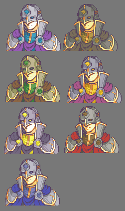
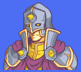
WIP for the Generic Diviner/Justice(Strong/Subboss tier)
Ilia, Bandit
Sacae, Bern
Etruria, Western
Ostia
There will probably only be Etrurian/Bern/Ostian and possibly Ilian Justice units so the Sacae/Bandit/Western palettes not looking the best don't matter that much for this class
Don't know about the glowing eye holes, or the quick attempt at a mail hood, I know parts of the shading need work too
But yeh, main area of concern for me is the helm in general, so I may or may not go with this helm
HAHA According to Nickt, "It's shit, like your[my] face", So yeh, if it is in fact shit... like my face(I actually think I have a pretty cool face but w/e y'know) let me know what to fix
#85
Fire Blazer
-

- Creator
-

- 12,103 posts
You ready?
- Gender:Male
- Location:U.S.A.
- Interests:Too many to list. =P
Posted 17 December 2010 - 11:25 PM
Regardless of what you say, I cannot be persuaded to look at all those long columns of similar portraits.
The idea of a generic sub-boss is both unoriginal and in a way cool (as it makes non-generic-sub-bosses cooler). Do show us the non-WIP version because as bad a spriter as I am I can see some flaws... and not just the iffy texture on the helm.
(Remember, when watching videos of this stuff, everything will be blown up, so not-so-obvious "meh" stuff might be more obvious...)
Signature thanks to Shu.
#86
Vamp
-
- Members
-
- 64 posts
Member
Posted 17 December 2010 - 11:54 PM
The subboss tier is shared with the strong tier, so you'll likely see them as level 15+ t1's or t2's or as the subbosses(protecting the throne but not on it, etc)
The different rows just have the different colour schemes, the only reason I post them all is for people to critique the palette if they want to, e.g. sacae and western colours don't look that great on the justice, this isn't really an issue as justice is an armored caster and probably wont be sacaen or western or even bandit in origin.
I posted the WIP for cnc and I'm currently fixing any and all flaws mentioned and other ones I've noticed myself.
FE7X seems to be automatically set to 200% size so i really do want my sprites as flawless as possible if most people are seeing them more up close than usual I think I've done pretty well on most of them and the ones that arent at that stage yet I'm probably still editing.
The different rows just have the different colour schemes, the only reason I post them all is for people to critique the palette if they want to, e.g. sacae and western colours don't look that great on the justice, this isn't really an issue as justice is an armored caster and probably wont be sacaen or western or even bandit in origin.
I posted the WIP for cnc and I'm currently fixing any and all flaws mentioned and other ones I've noticed myself.
FE7X seems to be automatically set to 200% size so i really do want my sprites as flawless as possible if most people are seeing them more up close than usual
I think I've done pretty well on most of them and the ones that arent at that stage yet I'm probably still editing.
#87
Vamp
-
- Members
-
- 64 posts
Member
Posted 18 December 2010 - 11:47 AM

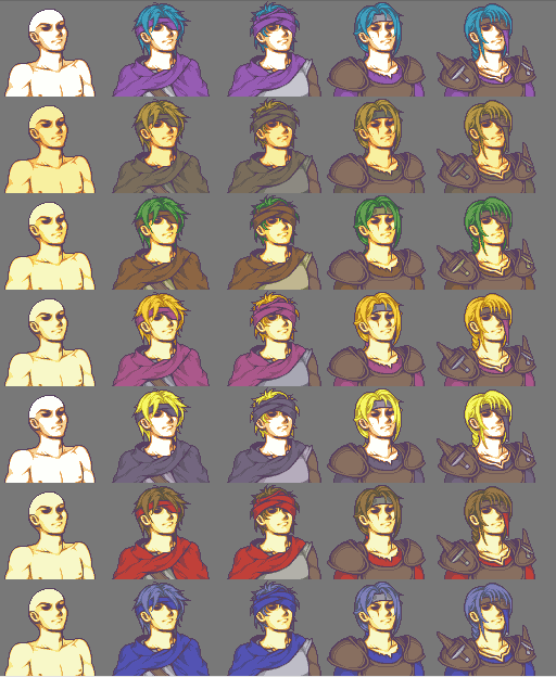
Thief/Rogue Generic Portrait
1 - 2 - 3 - 4
weak - mid - norm - strong/subboss
I had to change the Ilian palette because purple is their secondary colour and theif/rogue only use hair colour, primary colour(the colour of their cloaks) and tertiary(the greys and taupes of the shirts of the first 2)
Also added a necklace to 1 and 2 and a neck tattoo to 3 and 4 as though the neck was shaded properly, it came across as boring, added a scar to 4 to signify the eyepatch more and just generally tweaked their hairs, slimed the line of 2's chest so as to make him less bulky looking in that area.
Diviner/Justice Generic Portrait
4
strong/subboss
Removed the coif, added a helm back, tidied and tweaked everything else, including but not limited to re-aligning his spikes and their plates, re-sizing and moving his collar, adding cheek-plates to the helm, re-shading his robe, the robe is the main thing I'm iffy about now.
Also revised the pallete for the Justice and decided against using hair colours for the undershirt and spikes, so instead I'm using the countries secondary colours(which for the most part are pretty similar to the hair anyway haha)
#88
Fire Blazer
-
- Creator
-
- 12,103 posts
You ready?
- Gender:Male
- Location:U.S.A.
- Interests:Too many to list. =P
Posted 18 December 2010 - 02:57 PM
The generic rogue/thief is so sinister it is almost ridiculous...
I definitely think the 2nd and 4th versions are the best. The eyepatch looks meh and doesn't seem fitting. The 3rd one looks like a guy who forgot to put on all his armor more than a thief. Somehow the other additions to the 4th one return him back to a rogue-y picture, IMO. The knives, end of his hair, trim, scar, etc., all help make it a cool portrait.
As you can see I have little actual spriting critique. That, and you never even asked which is best, so I am talking about something somewhat irrelevant... XD
Signature thanks to Shu.
#89
Vamp
-
- Members
-
- 64 posts
Member
Posted 18 December 2010 - 09:57 PM
I also definitely prefer the 2nd and the 4th, the 1st has the excuse of being the weak build, but I may add a strap across the 3rds armor to maybe have it more rogueish I dno, if I don't I'm pleased with how it is.
The good thing is I don't have to pick 1/4 because depending on the level of the thief, they get a new mug.(lvl 20 thief will get the rogue mug, I actually disagreed with yeti on this and i thought lvl 1-10 t1 should get the weak mug, lvl 11-20 t1 should get the mid, lvl 1-10 t2 should get the norm mug, lvl 11-20 should get the strong along with subbosses getting the strong too.)
The good thing is I don't have to pick 1/4
because depending on the level of the thief, they get a new mug.(lvl 20 thief will get the rogue mug, I actually disagreed with yeti on this and i thought lvl 1-10 t1 should get the weak mug, lvl 11-20 t1 should get the mid, lvl 1-10 t2 should get the norm mug, lvl 11-20 should get the strong along with subbosses getting the strong too.)
#90
Vamp
-
- Members
-
- 64 posts
Member
Posted 19 December 2010 - 12:01 AM
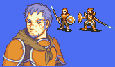
Still tweaking parts of the trim and the shirt shading though. But I think I've sorted(for the most part, I still might fix it a bit more) The angle issue.
And just so everyone knows which class this is

 Yeti's battlesprites for them, and the class description, from Immortal Sword site, http://www.bwdyeti.com/fe7x/
#91
Fire Blazer
-
- Creator
-
- 12,103 posts
You ready?
- Gender:Male
- Location:U.S.A.
- Interests:Too many to list. =P
Posted 19 December 2010 - 03:36 AM
Meh I'm no fan of either class so I will just on how fat that subboss's chin is.
Signature thanks to Shu.
#92
Vamp
-
- Members
-
- 64 posts
Member
Posted 19 December 2010 - 05:43 AM
I love both classes! All the fe7x classes are amazing and the animations, as per usual are at yeti's near flawless standard.

There's no issue with his chin, it's just broad is all.
There's no issue with his chin, it's just broad is all.
#93
Fire Blazer
-
- Creator
-
- 12,103 posts
You ready?
- Gender:Male
- Location:U.S.A.
- Interests:Too many to list. =P
Posted 19 December 2010 - 07:15 PM
Well I don't like broad chins...
and do you do that... body sketch thing... for EVERY custom portrait?
and do you do that... body sketch thing... for EVERY custom portrait?
Signature thanks to Shu.
#94
Vamp
-
- Members
-
- 64 posts
Member
Posted 19 December 2010 - 09:34 PM
Not all, but a lot of them, I do for all the generics though, as I need to give each one 4 outfits
With my other stuff I do it sometimes, but other times if I'm more certain of the pose I'll just line out their clothing or armor
With my other stuff I do it sometimes, but other times if I'm more certain of the pose I'll just line out their clothing or armor
#95
Vamp
-
- Members
-
- 64 posts
Member
Posted 23 December 2010 - 02:23 AM

Longbow 'wo' man Normal build(3)
For fe7x(Battle sprite by Yeti of course)
I know there are still some issues that I need to fix, particularly for the hair to look better in the blonde colours, so I might fix the shading on one of the blondes and then apply it to the others and see if that works(as in shade the hair as if it were lighter and hope it looks ok on the darker tones)
Bennet, Fe7x, Soldier/Halberdier(Battle sprites again, by Yeti)
Mainly still tweaking his face and scarf, I'm pretty happy with most of it, but if you guys see something you think I should address, just let me know.
Anyways
yeh!p.s.

Doubled up the string for the mid(2) Thief
#96
Fire Blazer
-
- Creator
-
- 12,103 posts
You ready?
- Gender:Male
- Location:U.S.A.
- Interests:Too many to list. =P
Posted 29 December 2010 - 02:23 PM
LOL so many palettes
I love how female bosses tend to be archers or magesor maybe that trend is just my imagination
Bennet's portrait is uh, just really well done, in general. Is he an OC for Immortal Sword?
I love how female bosses tend to be archers or mages
Bennet's portrait is uh, just really well done, in general. Is he an OC for Immortal Sword?
Signature thanks to Shu.
#97
Vamp
-
- Members
-
- 64 posts
Member
Posted 30 December 2010 - 03:17 AM
Yeh, Bennet is one of Mykes designed oc and he's playable

Loljpeg haha silly phone(at a holiday house and can't upload any other filetype from my phone) but if you guys can make out enough to throw some general cnc my way that'd be helpful haha
IMO the main thing I dislike are the eyes on the nonhat ones I think they need to be flatter across the top
Haha a lot of our bosses and pcs are very interesting combos, just needed fem archer/longbows for the trial
#98
Fire Blazer
-
- Creator
-
- 12,103 posts
You ready?
- Gender:Male
- Location:U.S.A.
- Interests:Too many to list. =P
Posted 30 December 2010 - 03:54 AM
The neck line where the uh... collarbone? idk thing is seems a little accented... and to me, it sticks out.
on the 3rd column one of each palette on the right shoulder our POV, the shirt extends off the shoulder and is a straight line, making it look heavily stiff, almost like fixed armor, instead of a flexible cloth
on the 3rd column one of each palette on the right shoulder our POV, the shirt extends off the shoulder and is a straight line, making it look heavily stiff, almost like fixed armor, instead of a flexible cloth
Signature thanks to Shu.


0 user(s) are reading this topic
0 members, 0 guests, 0 anonymous users

