well after 2 weeks i have some stuff to show, but first y whant to say what I had been feeling so far...
is my first time in GIMP and sprites stuff and i realy dont know if i doing it good or bad xD
anyway here it is my mug work
the chibis sucks will work on that later
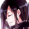
Some battle animation
he is the red-long hair guy, his name is Firon
Now im working in wite armour guy Aeron
perhaps he still need more work...
Toggle shoutbox Shoutbox
|
Ho-su Gallery
Started by Ho-su, Sep 08 2013 03:55 PM
6 replies to this topic
#1
Posted 08 September 2013 - 03:55 PM
#2
Posted 08 September 2013 - 05:09 PM
First off, rule #1 of spriting is NEVER save you images as .jpgs. If you're not using .pngs, then your spriting life will have may iusues. Essentially, a .jpg tries to make the image look smother and more lifelike, but in the world of spriting, that means it screws up the color scheme and makes everything blurry.
I'm not really qualified to critique animations, but I can say that you have some frame overlap during the reset. Either its overlap or a motion blur that could use a little work.
#3
Posted 08 September 2013 - 11:50 PM
QUOTE |
Essentially, a .jpg tries to make the image look smother and more lifelike |
...uh, what?
I believe in judgment of humans through their judgment of fiction, for nothing else tells better of their disposition freed from apprehension.
#4
Posted 09 September 2013 - 04:19 AM
In photographs. .jpgs are designed to work with photographs, which means they are designed for images on the scale of millions of pixels, and so they screw up when you try to save a few hundred pixels in .jpg format. Long story and probable idiocy short, use .pngs for all your sprites.
#5
Posted 09 September 2013 - 11:41 PM
It's obvious where you did stuff by hand. It's good to try, but you should definitely try to get a better feel for mugs before you try any custom work. I haven't attempted too much of that yet because every time I do it just looks sloppy and worse than anything you've done honestly. The second one has something off about her eyes. I think you just moved the eyes from another mug? when you do that you have to make sure you recolor the skin around the eye to match the face you just put them on. I can make a reference for you if you want to see what i'm talking about. On the 6th one you made the lines in his hair far too dark. It just doesn't look natural, use the color palette from another mug maybe? the 4th one has very chunky hair, if that's what you were going for well done, the shading is pretty good, and you got it to fit fairly well with the head. and the fifth one looks like his cheek is bulging a bit where the collar overlaps his head. I couldn't tell you how to fix that one other than use a different head that has a proper angle for that collar, or a different body that matches the angle of the head. you could even remove the collar and it would look just fine, but at that point you would have to put skin in by hand which is a pain. It is a small area so it wouldn't be terrible but still. I know I kinda tore these apart, but that's the best way to learn. If someone critiques your work as hard as I did you'll learn from it and hopefully won't be making mistakes for very long. Now here comes the praise ^.^. The first and second mugs are excellent for someone just starting like you say you are. And your battle sprites are really good too. I hope you keep it up because all of this is good for someone new to spriting. even with all the critique I gave you, at two weeks my stuff was far worse than this. Just as an example...
and that's not even the worst, I'm honestly too embarrassed to put that one up because it's horrifingly bad.
#6
Posted 15 September 2013 - 11:12 PM
First, thx for the critics and the PNG advice it had help and finaly i have some time for relax and continue my news mains characters
The brothers Firon and Aeron remake
Tomas and Alice
Namire and Meledy
i have doubt about the collors, any suggestions?
Meanwhile in battle animation progres i still need more practice...
The brothers Firon and Aeron remake
Tomas and Alice
Namire and Meledy
i have doubt about the collors, any suggestions?
Meanwhile in battle animation progres i still need more practice...
x (Click Here To Hide/Show Text)
#7
Posted 25 September 2013 - 06:29 AM
Liking the Farina/Tana mix, the colors contrast very well.
If I was any good with animations I would suggest putting some blur on the back jump and maybe altering the sword's path of motion to not look so much like an Eliwood redraw. Otherwise, it's pretty good.
0 user(s) are reading this topic
0 members, 0 guests, 0 anonymous users