Jump to content


Toggle shoutbox Shoutbox Open the Shoutbox in a popup

@  Oblivion Knight : (26 February 2024 - 11:30 AM) Whoa I can edit a typo. The technology.
@  Oblivion Knight : (26 February 2024 - 11:29 AM) Obligatory message.
@  Elwood : (02 January 2024 - 04:19 AM) Happy New Year!!!
@  Aaron : (13 February 2023 - 09:19 PM) I'm still out here alive. If you remember me, I hope you're doing well!
@  Aaron : (13 February 2023 - 09:09 PM) 2023 and this place is still up huhh
@  Elwood : (05 January 2023 - 07:58 AM) Ah a Christmas greeting from Wolfie! Even if I saw it way late Merry Christmas and Happy New Year to everybody!
@  Cero : (31 December 2022 - 09:27 PM) Man that bot went crazy
@  Whitewolf8 : (24 December 2022 - 10:02 AM) I return once more on the eve of Christmas to haunt you all again!... Mainly Elwood. Hello!
@  Elwood : (25 November 2022 - 04:58 AM) A bot! Ah the nostalgia!
@  Elwood : (02 November 2022 - 02:30 PM) Yo ho ho ho! Thar be the white wolf!
@  Whitewolf8 : (24 October 2022 - 12:29 AM) Well, blimey it's been a while. Hoy there! If anyone's still alive here anyway.
@  Valke : (21 April 2022 - 12:12 PM) im taking the 2nd shout of 2022 😂
@  Elwood : (03 March 2022 - 10:12 PM) Mwuhahaha! The first shout of 2022 is mine!
@  Fire Blazer : (12 November 2021 - 05:22 PM) *also stretches arms a little*
@  xcrash1998 : (07 November 2021 - 08:42 PM) "streches arms"
@  Ezra : (07 May 2021 - 05:20 AM) Maybe I'll pop on the discord soon
@  Fire Blazer : (01 April 2021 - 08:08 PM) Aaaaaaand done~ :P
@  xcrash1998 : (29 March 2021 - 08:52 AM) I guess we are one more post away from counting to 2500
@  Fire Blazer : (10 March 2021 - 11:39 PM) but I have bad memory and can't remember ;(
@  Elwood : (15 February 2021 - 10:23 AM) I'd like to but I've told you about my issues with discord before.

Photo

PHP Forum System


  • Please log in to reply
15 replies to this topic

#1 Tino

Tino

    Omega Member

  • Veterans
  • PipPipPipPipPipPipPipPipPipPipPipPip
  • 1,089 posts
  • Location:The Netherlands

Posted 10 March 2009 - 08:13 PM

I was doing some stuff for the "surprise" I'm creating for you guys, when I decided to take a break and suddenly thought that it would be a pretty good challenge to attempt and create my own forum system. So a couple of minutes ago, I finished the basic design. It's all I've got, really: a design. Everything you see on there is put in dynamically using PHP, though. Things I want to do at least are creating a user registration and login system, creating a topic and messages list, allowing users to add topics and replies, create an administrative section in which the administrator can add categories and forums, and create an option to edit posted messages (though obviously, users will only be able to edit their own messages).

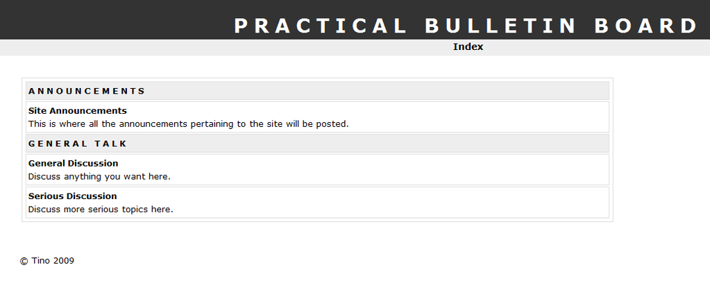
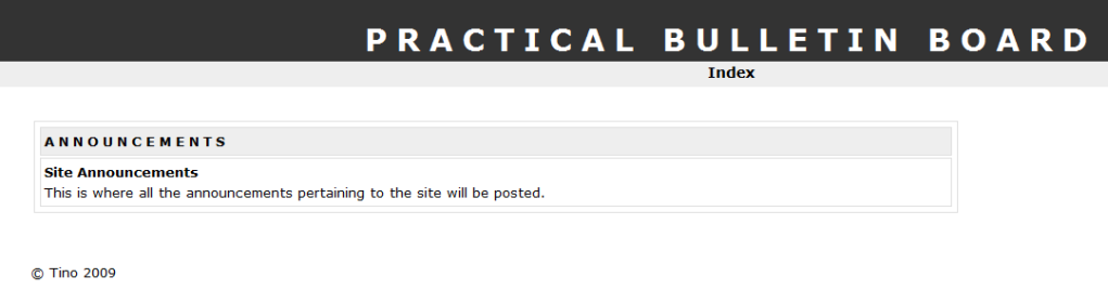
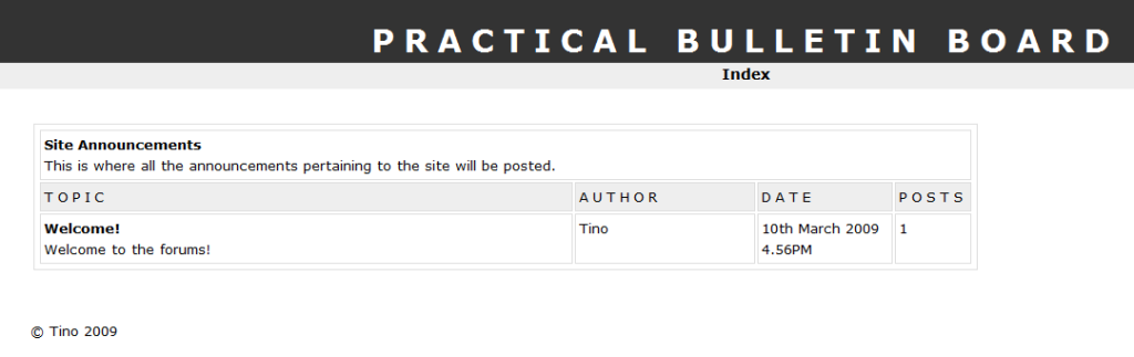
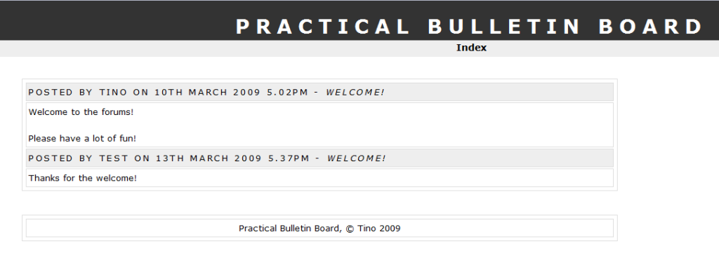
Here's a preview of what it looks like so far: http://i269.photobuc.../index_test.png

Perhaps it's a little hard to see because the forum has a white background, but I think you should be able to manage. Also, don't mind the title at the top. It's more of a slogan than a forum title >_>

And again, everything was put in dynamically, though I didn't mention that I'm using modern techniques, which means I'm utilizing object-oriented programming to create this. Also, I'm using a MySQL database for this. I also am not using the "old" HTML anymore. Rather, I'm using the newer, better XHTML version 1.0 here. Obviously, I'm using CSS for the styling of the forum, and I wouldn't be surprised if some XML (obviously combined with XSLT and XPath) will come in handy later, if I decide to expand outside of the features that I mentioned at the start of this post. I'm saying this to make sure you realize that this will be a modern coded forum system, so with the more modern techniques and languages.

Just thought I'd post it here for the few people that might actually be interested in it. wink.gif

Please comment on what it looks like so far.

Even if nobody responds, I'll still keep you guys a bit up-to-date with this.

#2 Fire Blazer

Fire Blazer

    You ready?

  • Creator
  • 12,103 posts
  • Gender:Male
  • Location:U.S.A.
  • Interests:Too many to list. =P

Posted 10 March 2009 - 09:01 PM

Cool little 'project' of yours. Not too bad, I'd say more but it's obvious it has a lot of work to be done.

FES originally used XHTML version 1.0 but I ended up optimizing it for some HTML thing because it had too many errors and problems and the such and if I kept it at XHTML I couldn't get rid of most of them. >_< I'm only mentioning because... eh.

Good luck man. happy.gif

Bblazer2.png

Signature thanks to Shu.


#3 Tino

Tino

    Omega Member

  • Veterans
  • PipPipPipPipPipPipPipPipPipPipPipPip
  • 1,089 posts
  • Location:The Netherlands

Posted 10 March 2009 - 09:28 PM

Odd, because you should be able to do with XHTML what you can do with normal HTML...

Anyway, thanks. smile.gif

#4 Fire Blazer

Fire Blazer

    You ready?

  • Creator
  • 12,103 posts
  • Gender:Male
  • Location:U.S.A.
  • Interests:Too many to list. =P

Posted 10 March 2009 - 10:11 PM

It's a matter of errors created amidst validation; there are slight differences between them and I was unable to maneuver around XHTML to reduce the hundreds of errors... Check http://www.feshrine.net/newlayout/ and validate it and compare the default setting to XHTML (any 1.0 version will work); you'll see XHTML brings up 200 more errors and when I tried to maneuver around it I was ultimately unsuccessful.

So that should clarify my previously vague point~

Bblazer2.png

Signature thanks to Shu.


#5 Tino

Tino

    Omega Member

  • Veterans
  • PipPipPipPipPipPipPipPipPipPipPipPip
  • 1,089 posts
  • Location:The Netherlands

Posted 10 March 2009 - 10:29 PM

When I validate it, I get 7 errors and 1 warning... Odd.

Also, it's blue! I hadn't expected to see that when I clicked the link >_>

I'm derailing my own thread. Awesome.

#6 Fire Blazer

Fire Blazer

    You ready?

  • Creator
  • 12,103 posts
  • Gender:Male
  • Location:U.S.A.
  • Interests:Too many to list. =P

Posted 11 March 2009 - 12:00 AM

I changed the skin, there's also another banner that matches the Turquoise skin.. O_o

To continue to derail, set it to XHTML 1.0 Strict and you will find 200+ errors and my point will be proved. Yes even with whatever I set the default setting to it still has a few errors but it's good enough for me; it's a drastic improvement from the site now (http://www.feshrine.net)

Bblazer2.png

Signature thanks to Shu.


#7 Tino

Tino

    Omega Member

  • Veterans
  • PipPipPipPipPipPipPipPipPipPipPipPip
  • 1,089 posts
  • Location:The Netherlands

Posted 11 March 2009 - 06:22 AM

Yeah, never mind. I just realized I validated it with HTML 4.01. XHTML 1.0 Strict results in 218 errors and 1 warning, Transitional a little bit less. I understand why you wouldn't want to edit all those errors ohmy.gif

#8 Fire Blazer

Fire Blazer

    You ready?

  • Creator
  • 12,103 posts
  • Gender:Male
  • Location:U.S.A.
  • Interests:Too many to list. =P

Posted 11 March 2009 - 07:57 PM

Misunderstanding; I TRIED to but I was unable to despite all my efforts and I was able to maneuver the code with HTML 4.01 (decreasing the errors from 85 to 7 and warnings from 16 to 1).

tongue.gif

We've digressed too much; how fairs this project of yours? Any new screens? tongue.gif

Bblazer2.png

Signature thanks to Shu.


#9 Tino

Tino

    Omega Member

  • Veterans
  • PipPipPipPipPipPipPipPipPipPipPipPip
  • 1,089 posts
  • Location:The Netherlands

Posted 11 March 2009 - 08:07 PM

A few, yes.

View Category: http://i269.photobuc...90/view_cat.png
This shows the category name, which links back to itself, as well as the forum name, which links to the appropriate forum. The forum also has a description.

View Forum: http://i269.photobuc.../view_forum.png
This shows the topic list. It links back to itself at the top, and shows various things such as the topic title (which links to the topic), the topic description, numbers of posts in a topic, topic author, and date it's posted. The topic author also links to the profile of the author.

View Topic: http://i269.photobuc.../view_topic.png
The start of the page that displays the topic. It only includes a header that states who posted the topic, which links to the author's profile.

It's all I have so far. I'm gonna be working on finishing the "view topic" page, and after that I'm going to create the user login and registration systems.

I personally think it's looking pretty nice and clean so far smile.gif

#10 Fire Blazer

Fire Blazer

    You ready?

  • Creator
  • 12,103 posts
  • Gender:Male
  • Location:U.S.A.
  • Interests:Too many to list. =P

Posted 11 March 2009 - 08:11 PM

Yes it is, some suggestions, footer could be slightly more elaborate and be centered and possibly in a table of its own, the text at the top doesn't look centered (are you just cutting off the right-side or something?) and yeah that's it so far, I'll be sure to test it out once it reaches completion (hopefully it will).

Bblazer2.png

Signature thanks to Shu.


#11 Tino

Tino

    Omega Member

  • Veterans
  • PipPipPipPipPipPipPipPipPipPipPipPip
  • 1,089 posts
  • Location:The Netherlands

Posted 11 March 2009 - 08:17 PM

Yeah, the text at the top is centered. I'm just cutting part of the entire PrintScreen image off, because it's way too large if I don't.

Perhaps it isn't so obviousy, but the footer is in its own table. Or at least, it doesn't just float there. The body of the forum is aligned to the left, so I think aligning the footer to the center would look pretty awkward... Though I agree, it could be a bit more elaborate. Thanks smile.gif

And I actually plan on completing this. I doubt I'll be able to make this all that technical (like IPB, PhpBB, etc.), but I think I can at least make a good-looking forum system just to give myself a good challenge and see what I'm actually capable of. I do plan on expanding outside of the features I mentioned in the first post, actually, so at least it isn't going to be incredibly boring (for example, I plan on adding some kind of user profile, and a place where the user can modify his or her profile).

Overall, I think I can at least have fun trying to do this smile.gif

Thanks smile.gif

#12 Fire Blazer

Fire Blazer

    You ready?

  • Creator
  • 12,103 posts
  • Gender:Male
  • Location:U.S.A.
  • Interests:Too many to list. =P

Posted 11 March 2009 - 08:25 PM

Yes, fun is good. xD

Coding-wise the table is probably existent however I was considering the addition of a border so that it doesn't float like that; just to give it its own little area. :\

Bblazer2.png

Signature thanks to Shu.


#13 Tino

Tino

    Omega Member

  • Veterans
  • PipPipPipPipPipPipPipPipPipPipPipPip
  • 1,089 posts
  • Location:The Netherlands

Posted 11 March 2009 - 08:27 PM

Hmm, I suppose I can at least give it a try, just to see how it looks.

Now that I'm thinking of it, I can make the footer just as wide as the forum body, center the text, and make it a bit more elaborate... It'll probably look pretty good, actually. I'll try it out immediately. Thanks wink.gif

#14 Tino

Tino

    Omega Member

  • Veterans
  • PipPipPipPipPipPipPipPipPipPipPipPip
  • 1,089 posts
  • Location:The Netherlands

Posted 13 March 2009 - 08:02 PM

Woot. I actually got displaying the posts within the topics done smile.gif

View it here

Also, as you see, I changed the footer. Looks a lot better, doesn't it?

Next things on the to-do-list would be the user registration and the login/logout system.

#15 Fire Blazer

Fire Blazer

    You ready?

  • Creator
  • 12,103 posts
  • Gender:Male
  • Location:U.S.A.
  • Interests:Too many to list. =P

Posted 14 March 2009 - 06:23 PM

Awesome, user registration and login/logout sound complicated, good luck with them. smile.gif

Bblazer2.png

Signature thanks to Shu.


#16 Tino

Tino

    Omega Member

  • Veterans
  • PipPipPipPipPipPipPipPipPipPipPipPip
  • 1,089 posts
  • Location:The Netherlands

Posted 14 March 2009 - 10:46 PM

I've managed to do that before. It just was incredibly insecure. So I plan on making a similar system except with a little more security added to it. Oh yeah, and I plan on adding a verification e-mail thingy to it. That's probably going to be the most complicated part.

EDIT: I also centered the content area so that it looks a bit better smile.gif


0 user(s) are reading this topic

0 members, 0 guests, 0 anonymous users