Jump to content


Toggle shoutbox Shoutbox Open the Shoutbox in a popup

@  Oblivion Knight : (26 February 2024 - 11:30 AM) Whoa I can edit a typo. The technology.
@  Oblivion Knight : (26 February 2024 - 11:29 AM) Obligatory message.
@  Elwood : (02 January 2024 - 04:19 AM) Happy New Year!!!
@  Aaron : (13 February 2023 - 09:19 PM) I'm still out here alive. If you remember me, I hope you're doing well!
@  Aaron : (13 February 2023 - 09:09 PM) 2023 and this place is still up huhh
@  Elwood : (05 January 2023 - 07:58 AM) Ah a Christmas greeting from Wolfie! Even if I saw it way late Merry Christmas and Happy New Year to everybody!
@  Cero : (31 December 2022 - 09:27 PM) Man that bot went crazy
@  Whitewolf8 : (24 December 2022 - 10:02 AM) I return once more on the eve of Christmas to haunt you all again!... Mainly Elwood. Hello!
@  Elwood : (25 November 2022 - 04:58 AM) A bot! Ah the nostalgia!
@  Elwood : (02 November 2022 - 02:30 PM) Yo ho ho ho! Thar be the white wolf!
@  Whitewolf8 : (24 October 2022 - 12:29 AM) Well, blimey it's been a while. Hoy there! If anyone's still alive here anyway.
@  Valke : (21 April 2022 - 12:12 PM) im taking the 2nd shout of 2022 😂
@  Elwood : (03 March 2022 - 10:12 PM) Mwuhahaha! The first shout of 2022 is mine!
@  Fire Blazer : (12 November 2021 - 05:22 PM) *also stretches arms a little*
@  xcrash1998 : (07 November 2021 - 08:42 PM) "streches arms"
@  Ezra : (07 May 2021 - 05:20 AM) Maybe I'll pop on the discord soon
@  Fire Blazer : (01 April 2021 - 08:08 PM) Aaaaaaand done~ :P
@  xcrash1998 : (29 March 2021 - 08:52 AM) I guess we are one more post away from counting to 2500
@  Fire Blazer : (10 March 2021 - 11:39 PM) but I have bad memory and can't remember ;(
@  Elwood : (15 February 2021 - 10:23 AM) I'd like to but I've told you about my issues with discord before.

Photo

Super Surprise Surprise~!


  • Please log in to reply
20 replies to this topic

#1 Fire Blazer

Fire Blazer

    You ready?

  • Creator
  • 12,103 posts
  • Gender:Male
  • Location:U.S.A.
  • Interests:Too many to list. =P

Posted 21 December 2008 - 09:33 PM

After working my ass off since December 6th (that's two weeks, mind you) I've finally gotten enough progress on the site to give my fellow forum members a preview!

http://www.feshrine.net/newlayout/

Compare it to the old one, and you should find it much, much better. None of the links work, btw-- this is just the index/main page template. Things to note-

- New Favicon (FEDS tome Starlight, thanks to Celice for the weapon sprite rip)
- New Banner (by Shu, GFX Artist)
- New slogan
- New top menu ordering, positioning, style, and the black bar background (waiting for Shu to make the black bar a little better)
- New link to Hall of Fame on top menu
- Navigation menu boxes are different sizes, changed to black to avoid complete over usage of green
- New map sprites that are transparent (instead of the same old non-transparent Elbert map sprite)
- Added "Forum Events" to community section
- There is a map sprite for each color
- Links to the games are simpler, not "feshrine.net/fireemblem1.html" but just "feshrine.net/fe1.html"
- "News" banner goes to the update archive
- Minor changes to the update posts
- Fixed a CSS problem where links were ALWAYS font size 12 (major problem is no more biggrin.gif)
- Cleaned up CSS and site code in general to make it better, cleaner, more organized, etc.
- Minor adjustments to those google ads that haven't made me much money >.<
- Footer isn't just a blob of text, it's in its own box, is centered, organized, slightly revised. Same goes with the topsites and the hit counter (although I don't even know if that crappy hit counter even works)
- Centered the whole page and aligned it perfectly with the banner, also spreading things out instead of making it cramped and clumped together
- Changed colors around here and there to blend in and give it a less dark feeling and a more welcoming feeling


That's it for now, PLEASE PLEASE PLEASE comment, suggest, give me suggestions and criticism, things to improve on, anything you are looking for, etc.

Also, I mentioned some custom features here and there, in the shoutbox and in the staff forum... more than anything else I mentioned a feature to correlate the forums with the mainsite, that won't be happening just yet unfortunately but if you have any ideas please share them.

Also, if you want to make me mad, simply tell me that you think "there isn't much of a difference", "it sucks more than before", "you hardly even did anything", "you didn't try", "you suck at site-making dude", etc., and consequently I will either make your life much, much worse or I will give up on my own life. >_<

Bblazer2.png

Signature thanks to Shu.


#2 Tino

Tino

    Omega Member

  • Veterans
  • PipPipPipPipPipPipPipPipPipPipPipPip
  • 1,089 posts
  • Location:The Netherlands

Posted 21 December 2008 - 09:50 PM

I'd love to comment on everything, but all I see is what I assume is the footer, which is located at the center of the screen... Perhaps because of the browser I'm currently using?

#3 Soviet Comrade

Soviet Comrade

    Mega Member

  • Veterans
  • PipPipPipPipPipPipPipPipPipPip
  • 585 posts
  • Location:Soviet Russia
  • Interests:???????????? ??????????

Posted 21 December 2008 - 10:00 PM

Needs more Desu.

Seriously though, it's sexy.

#4 Meriah

Meriah

    Great Member

  • Members
  • PipPipPipPipPip
  • 113 posts

Posted 21 December 2008 - 10:07 PM

The site's name, on the banner, looks a tad small/obscured. There's probably more, but that's the most obvious thing to me.

#5 Ramiel

Ramiel

    Mega Member

  • Members
  • PipPipPipPipPipPipPipPipPipPip
  • 874 posts
  • Location:New Hampshire

Posted 21 December 2008 - 10:15 PM

I only see the footer as well.

#6 Tino

Tino

    Omega Member

  • Veterans
  • PipPipPipPipPipPipPipPipPipPipPipPip
  • 1,089 posts
  • Location:The Netherlands

Posted 21 December 2008 - 10:30 PM

Viewing it in Google Chrome actually worked wink.gif

Now, for my comments~

Not that a favicon is the most important aspect of the site, but I do think the previous favicon, the red/grey sword icon, was far better, since it actually matched the site colors. A blue tome doesn't really match an entirely red layout, unless I'm mistaken.

The banner itself is pretty awesome aside of the copyright notice. Though, with the layout and the background, I personally don't think it really looks very exceptional. It doesn't look very bad, but it could definitely use some improvement. I'd say the black menu bar below it should have 1 pixel borders, and that there should be some kind of bar above it as well, to make it look better with the borders the banner has. And I also think the background should be just the same red we used to have, or a color close to it. That probably looks much better.

With the slogan, you probably mean "True Justice", right? I must say it has an awesome ring to it. Sweet choice, if you ask me.

As for the top menu, the order of the links is fine, but the bar indeed needs to be a bit better. I don't think the bar needs to be so high; it can be a bit lower. And right now, I also feel the gradient is unnecessary, though that might change if it is lowered. And like I said, it needs borders around it and I think it should be complemented with the same bar above the banner, with whatever kind of message or links in it, to make the banner look better. And if not, then at least the bar should be put right against the banner, so that you have a 2 pixel border, which looks pretty good. But believe me, two of those bars, which should be about twice as low, will make it look much better.

The Hall of Fame link is sweet. And it's a rather original name for a page as well. Or at least much less boring than the generic "Credits" or "Kudos".

I assume you mean the "Games", "Multimedia", "Affiliates" and "Community" boxes with "navigation menu boxes". Really, I'm impressed. I really like how they came out. Though I do think some kind of red color would make them look even better. Also, were the icons randomly chosen or do you have specific reasons for the icons you used? Like, I could imagine you used Hector for the "Games" section since those pages have something to do with the games "physically", while I would've used some kind of magic user for the "Multimedia" section because they aren't connected to the games as concrete as the pages in the "Games" section. Just some random nitpicking from me, really tongue.gif

With "Forum Events", I guess you mean activities that are going to happen on the forums, right? I don't think I really see how that could be useful, but I guess I'm overlooking some things.

Simpler links are always better, unless you're talking about PHP links, such as http://www.feshrine....ex.php?page=fe1 which would be a much better link. Good job on this one.

I never even realized links were always font size 12... Probably another thing I missed.

I looked at the CSS code (or rather, skimmed through it since I won't bother reading the entire code) and it indeed looks pretty organized. Not only will that make future layout changes much easier, but it also simply looks better if some dude feels the need to look at the CSS code tongue.gif

The footer is nearly perfect. If it's 900 pixels wide it's absolutely perfect. And if you're not sure if that hit counter works, I might be able to write some kind of hit counter with my still limited knowledge of PHP (but writing such counters shouldn't be too hard).

I must admit, you did a great job at centering everything and aligning it correctly with the banner. You have definitely earned yourself lots of cookies with it. Awesome work.

QUOTE
I mentioned a feature to correlate the forums with the mainsite, that won't be happening just yet unfortunately


Forum integration isn't possible without the forum being hosted on the site, for those who didn't know. This might be slightly confusing to those without any knowledge about webdesign or something, but don't worry, it's nothing you need to worry about anyway.

As a conclusion, I think the layout has definitely improved, except for the banner and top menu, which have become relatively worse (relatively is the key word, since it definitely isn't bad), and some other minor things. Really, you can be proud of what you have done so far, and with only a couple of minor improvements, the layout will be pretty much perfect. Great job!

#7 Fire Blazer

Fire Blazer

    You ready?

  • Creator
  • 12,103 posts
  • Gender:Male
  • Location:U.S.A.
  • Interests:Too many to list. =P

Posted 22 December 2008 - 12:06 AM

I'm going to kill this computer. I just typed up a long post in response to everything... >.<

[QUOTE]The site's name, on the banner, looks a tad small/obscured. There's probably more, but that's the most obvious thing to me.[/QUOTE]

Thanks. Next time I'll make sure Shu doesn't do that and that he backs up the graphic before he adds text... D:

[QUOTE]Needs more Desu.

Seriously though, it's sexy.[/QUOTE]

Thanks, and how can I add more Desu? xD

[QUOTE]I only see the footer as well.[/QUOTE

What browser? IE and FF are working so far. Haven't tested Safari or Opera yet.

[QUOTE]Not that a favicon is the most important aspect of the site, but I do think the previous favicon, the red/grey sword icon, was far better, since it actually matched the site colors. A blue tome doesn't really match an entirely red layout, unless I'm mistaken.[/QUOTE]

I thought about that. I planned on changing it again anyway because the 'new' favicon is 'old' to me (considering I've been seeing it for the past 2 weeks).

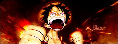
[QUOTE]The banner itself is pretty awesome aside of the copyright notice. Though, with the layout and the background, I personally don't think it really looks very exceptional. It doesn't look very bad, but it could definitely use some improvement. I'd say the black menu bar below it should have 1 pixel borders, and that there should be some kind of bar above it as well, to make it look better with the borders the banner has. And I also think the background should be just the same red we used to have, or a color close to it. That probably looks much better.

With the slogan, you probably mean "True Justice", right? I must say it has an awesome ring to it. Sweet choice, if you ask me.

As for the top menu, the order of the links is fine, but the bar indeed needs to be a bit better. I don't think the bar needs to be so high; it can be a bit lower. And right now, I also feel the gradient is unnecessary, though that might change if it is lowered. And like I said, it needs borders around it and I think it should be complemented with the same bar above the banner, with whatever kind of message or links in it, to make the banner look better. And if not, then at least the bar should be put right against the banner, so that you have a 2 pixel border, which looks pretty good. But believe me, two of those bars, which should be about twice as low, will make it look much better.[/QUOTE]

Bar and banner are dependent on Shu right now. The bar was just a make-shift of mine I did with Corel PSP. And although I want to make it a little different and not gradient like, I found it troublesome aligning the text to appear in the middle of the background... I was going to ask for your help but you're rarely on AIM.

[QUOTE]With "Forum Events", I guess you mean activities that are going to happen on the forums, right? I don't think I really see how that could be useful, but I guess I'm overlooking some things.[/QUOTE]

Sort of, it's a rather minuscule thing anyway and it won't be anything that special.

[QUOTE]Simpler links are always better, unless you're talking about PHP links, such as http://www.feshrine....ex.php?page=fe1 which would be a much better link. Good job on this one.[/QUOTE]

Thanks, and I actually hate how php links look and typing them out...

[QUOTE]I looked at the CSS code (or rather, skimmed through it since I won't bother reading the entire code) and it indeed looks pretty organized. Not only will that make future layout changes much easier, but it also simply looks better if some dude feels the need to look at the CSS code tongue.gif[/QUOTE]

Thanks again, I try xD

[QUOTE]The footer is nearly perfect. If it's 900 pixels wide it's absolutely perfect. And if you're not sure if that hit counter works, I might be able to write some kind of hit counter with my still limited knowledge of PHP (but writing such counters shouldn't be too hard).[/QUOTE]

It was originally 900px however it doesn't look as good with that width, which is why I decreased it. For one, the footer taking up just that little bit more of space makes it more significant and noticable which seeing as it's a footer, is not in my interest; perhaps I'm simply too immature in my web design. :/

[QUOTE]I must admit, you did a great job at centering everything and aligning it correctly with the banner. You have definitely earned yourself lots of cookies with it. Awesome work.
[/QUOTE]

Thanks, but quit the formal talk, man. It feels so uptight and serious. xP

[QUOTE]Forum integration isn't possible without the forum being hosted on the site, for those who didn't know. This might be slightly confusing to those without any knowledge about webdesign or something, but don't worry, it's nothing you need to worry about anyway./QUOTE]

I know that, dude... I was researching something on manipulating cookies but it appears way too hard and considering I lack 100% full control over the forums right now I'm not doing anything. If I'm going to do it in the feature, it'll be with the help of somebody who is experienced... After all, forum integration would also require somebody who's good at web design, and I plain suck at it, as we all know.

[QUOTE]As a conclusion, I think the layout has definitely improved, except for the banner and top menu, which have become relatively worse (relatively is the key word, since it definitely isn't bad), and some other minor things. Really, you can be proud of what you have done so far, and with only a couple of minor improvements, the layout will be pretty much perfect. Great job![/QUOTE]

The banner only looks worse do to the background. THe background is way too complex and it makes the banner look less attractive and special. I need Shu to make something that's simple but has a small texture to it, so that the background isn't completely boring (one color). Perhaps you're aware of a texture with thin diagonal lines that go from one corner to the other, made up of repeating tiles... I'm looking for something like this, but with a red color. It's hard to explain graphics though... after all, a picture's worth a 1000 words. :/

Bblazer2.png

Signature thanks to Shu.


#8 Ramiel

Ramiel

    Mega Member

  • Members
  • PipPipPipPipPipPipPipPipPipPip
  • 874 posts
  • Location:New Hampshire

Posted 22 December 2008 - 12:08 AM

I was using my Wii and I could see noting other then the footer.

#9 Fire Blazer

Fire Blazer

    You ready?

  • Creator
  • 12,103 posts
  • Gender:Male
  • Location:U.S.A.
  • Interests:Too many to list. =P

Posted 22 December 2008 - 05:07 AM

Oh, I see, I'll check it out on my Wii as well; perhaps it doesn't work on Opera... Try another browser though and see if it works, and tell me which one it is. :\

Bblazer2.png

Signature thanks to Shu.


#10 Tino

Tino

    Omega Member

  • Veterans
  • PipPipPipPipPipPipPipPipPipPipPipPip
  • 1,089 posts
  • Location:The Netherlands

Posted 22 December 2008 - 06:58 AM

QUOTE
What browser? IE and FF are working so far. Haven't tested Safari or Opera yet.


It didn't work for me in IE7, but it works in Google Chrome, so you don't have to test that one anymore.

QUOTE
Bar and banner are dependent on Shu right now. The bar was just a make-shift of mine I did with Corel PSP. And although I want to make it a little different and not gradient like, I found it troublesome aligning the text to appear in the middle of the background... I was going to ask for your help but you're rarely on AIM.


I guessed that already (the banner + bar thing). I guess I'll wait for Shu to finish that bar and then I can continue commenting on it.

I suppose I shall get on AIM a bit more then. To be completely honest, I sort of forgot about it. Also, assuming a 20 pixels high box and a 10 pixel fond (not 10pt, but 10px), margin-top: 5px; and margin-bottom: 5px; should do the job, unless I don't really get what you mean.

QUOTE
It was originally 900px however it doesn't look as good with that width, which is why I decreased it. For one, the footer taking up just that little bit more of space makes it more significant and noticable which seeing as it's a footer, is not in my interest; perhaps I'm simply too immature in my web design. :/


I understand. But then at least align it directly below the content area (where the news is displayed) and make it just as wide as that.

QUOTE
Thanks, but quit the formal talk, man. It feels so uptight and serious. xP


I didn't even realize I was being that formal tongue.gif

QUOTE
I know that, dude... I was researching something on manipulating cookies but it appears way too hard and considering I lack 100% full control over the forums right now I'm not doing anything. If I'm going to do it in the feature, it'll be with the help of somebody who is experienced... After all, forum integration would also require somebody who's good at web design, and I plain suck at it, as we all know.


Since you were talking about getting IPB once you have the money, this might help. Though I haven't really looked at it, it does seem like a sweet feature wink.gif

And I just realized this might be what FEP uses as well ohmy.gif

#11 Ramiel

Ramiel

    Mega Member

  • Members
  • PipPipPipPipPipPipPipPipPipPip
  • 874 posts
  • Location:New Hampshire

Posted 22 December 2008 - 03:32 PM

QUOTE (Tino @ December 22, 2008 01:58 am)
Since you were talking about getting IPB once you have the money, this might help. Though I haven't really looked at it, it does seem like a sweet feature wink.gif

And I just realized this might be what FEP uses as well ohmy.gif

FEplanet.net is a portal. just like FEU.

#12 Tino

Tino

    Omega Member

  • Veterans
  • PipPipPipPipPipPipPipPipPipPipPipPip
  • 1,089 posts
  • Location:The Netherlands

Posted 22 December 2008 - 03:45 PM

No. FEP doesn't use a portal. Quoting a post from SaS.

Well, I use this for integrating the site with the forums. As for coding, php.net and w3schools are your best friends if you're looking to learn. There isn't really any one-size-fits-all tutorials for anything, just the documentation on php.net and the link I gave you on forums integration.

Also, for the odd thing I use jQuery, which is a JavaScript library. It's really useful as well.


By the way, why the hell do quotes not work right?

#13 Fire Blazer

Fire Blazer

    You ready?

  • Creator
  • 12,103 posts
  • Gender:Male
  • Location:U.S.A.
  • Interests:Too many to list. =P

Posted 23 December 2008 - 12:07 AM

I really don't know, the forums hate me? D:

QUOTE
I understand. But then at least align it directly below the content area (where the news is displayed) and make it just as wide as that.


I'll try it out and see how it works.

Thanks for the long comments, they helped, and I'm still looking for more if any. xP

Bblazer2.png

Signature thanks to Shu.


#14 Tino

Tino

    Omega Member

  • Veterans
  • PipPipPipPipPipPipPipPipPipPipPipPip
  • 1,089 posts
  • Location:The Netherlands

Posted 23 December 2008 - 12:12 AM

You're welcome wink.gif

I don't know what else I should comment on, aside of the awesome news area (I'm really fond of it)...

#15 Shu

Shu

    Sealord

  • GFX Artist
  • 1,450 posts
  • Gender:Male
  • Location:Arrakis
  • Interests:Pimpin'

Posted 23 December 2008 - 01:10 AM

Dangit, I cant view anything because Im on my moms computer (Hence I cant donload Google Chrome or anything...)

*Tries to fix his computer*
user posted image
Gallery

I will not remove this until the Vikings win the Super Bowl - Started 1/28/11

"i had to google bukkake."
-Boney

#16 bblues

bblues

    The Greatest

  • Veterans
  • PipPipPipPipPipPipPipPipPipPipPipPipPipPipPipPipPipPipPipPipPipPipPipPipPipPipPipPipPipPipPipPipPipPipPipPip
  • 5,547 posts
  • Gender:Male
  • Location:United Kingdom
  • Interests:Stuff.

Posted 24 December 2008 - 09:53 AM

Looks cool, takes a bit longer to load though (only due to my connection, it would be insignificant at broadband)

#17 Ristau

Ristau

    LIGHTS Super-fan

  • Veterans
  • PipPipPipPipPipPipPipPipPipPipPipPip
  • 1,328 posts
  • Gender:Male

Posted 11 January 2009 - 05:33 PM

I made a Little Black Bar Sample. hope you like it xD

Attached Files

  • Attached File  496   4KB   0 downloads

Posted Image

#18 Tino

Tino

    Omega Member

  • Veterans
  • PipPipPipPipPipPipPipPipPipPipPipPip
  • 1,089 posts
  • Location:The Netherlands

Posted 11 January 2009 - 05:34 PM

Can you post it as a normal image (upload to Photobucket/Imageshack or something, then post it here by wrapping it in tags)?

#19 Fire Blazer

Fire Blazer

    You ready?

  • Creator
  • 12,103 posts
  • Gender:Male
  • Location:U.S.A.
  • Interests:Too many to list. =P

Posted 11 January 2009 - 05:35 PM

Corners need work, not right size, needs transitioning... It's a very good effort, but I'm looking for something without paint, thanks though dude, nice to know that people care.

Also, rofl@the title "Future Moderator", xDD.

Bblazer2.png

Signature thanks to Shu.


#20 Ristau

Ristau

    LIGHTS Super-fan

  • Veterans
  • PipPipPipPipPipPipPipPipPipPipPipPip
  • 1,328 posts
  • Gender:Male

Posted 11 January 2009 - 05:36 PM

Edit-- Here it is!

user posted image
Posted Image


0 user(s) are reading this topic

0 members, 0 guests, 0 anonymous users