Yeah as shadow said, the Lucius one down the bottom. But I also like the middle one with Brown hair
Toggle shoutbox
Shoutbox

|
|||||||||||||||||||||||||||||||||||||||||||||||||||||||||||||

Show off your work
Started by Seraphinox, May 06 2009 06:34 PM
230 replies to this topic
#61

Seraphinox
-
- Staff
-

- 4,263 posts
Scribe of the Heavens
- Location:Ireland
Posted 18 June 2009 - 07:09 PM
| QUOTE (The Best Matt) |
| "blazer posting sexy pictures.. was it tagged as blazzer?" |
| QUOTE ( Oblivion) |
| Seraphiroth is over rated |
#62
Rujio
-

- Veterans
-
- 1,721 posts
I eat Axel
Posted 18 June 2009 - 07:51 PM
I added talking and smiling frames for the blond one as well as a started mini-mug
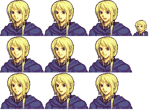
I'm having some troubles with the blinking frames and am still working on the mini-mug. Does anyone have any tips on how to make them easier/better?
I'm having some troubles with the blinking frames and am still working on the mini-mug. Does anyone have any tips on how to make them easier/better?
?????????
???????There, katakana. Happy?
???????
| QUOTE |
| Bobryk -- holy crap I look away for two seconds and I have knots all up in my shit |
#63
Blood Falcon
-

-
Banned -

- 1,079 posts
Halo fan
- Location:On your mom's bed. Under the covers with your mom. Showing off. My glow in the dark watch.
Posted 18 June 2009 - 07:59 PM
@the chibi:
It's not chibi like, the nose is still there, and when you resize a mug the shading becomes all messed up. Use a in game chibi as reference.
It's not chibi like, the nose is still there, and when you resize a mug the shading becomes all messed up. Use a in game chibi as reference.

I won't remove this until I get a killtacular in Halo MLG- Started December 29, 2010.
| QUOTE |
| Bloodfalcon22-pokemanzz cnt dye FELover3- If I beat the shit out of them they do |
| QUOTE |
| Rujio -- Cows are more important than anything. Rujio -- ANYTHING |
| QUOTE |
| Blood Falcon -- Hey bblues, are you able to ban the GoogleBot? bblues -- I don't think so. Blood Falcon -- Damn, lol. bblues -- He's above the law : P |
| QUOTE (Grey_Tensho @ March 10, 2010 04:07 pm) |
| Bloodfalcon is as crazy over copyright as youtube is lol. |
#64
Fire Blazer
-
- Creator
-

- 12,103 posts
You ready?
- Gender:Male
- Location:U.S.A.
- Interests:Too many to list. =P
Posted 18 June 2009 - 10:01 PM
^Still has a few little things to improve but it's SO much better now, Rujio. Incredibly better.
As for the chibi, here's what you need to do:
1) Re-add the outline
2) Mimic the original hair shading on the main portrait onto the chibi
3) Make the eyes chibi-like; look at an original chibi (like one of an actual character from an actual FE game) for reference. They are pretty much just straight vertical lines 2-3 pixels down
4) Fix the hair outline and the ear
5) Get rid of the nose, chibi's don't have noses
6) Fix the mouth. Once again look at a reference and even copy/paste.
7) Once that's done, touch up the face shading a little, it will probably need it.
8) Enjoy your much-improved (hopefully) chibi.
Signature thanks to Shu.
#65
Rujio
-
- Veterans
-
- 1,721 posts
I eat Axel
Posted 19 June 2009 - 04:20 AM
Well, here's the chibi with the edits you suggested. Thanks a ton for those.

Whatever else there is, feel free to tell me, although right now, I need more help with the blinking frames. Any tips for doing those?
Whatever else there is, feel free to tell me, although right now, I need more help with the blinking frames. Any tips for doing those?
?????????
???????There, katakana. Happy?
???????
| QUOTE |
| Bobryk -- holy crap I look away for two seconds and I have knots all up in my shit |
#66
cox21
-

- Members
-
- 587 posts
Cormag the Red, Ruby of the Grado Empire
Posted 21 June 2009 - 09:44 PM

Poor guy.

#67
Mankut
-

- Veterans
-
- 635 posts
Mega Member
- Gender:Not Telling
- Interests:You
Posted 22 June 2009 - 01:27 AM

My FER character.


| QUOTE |
| Fire Blazer -- Man Cute is on |
#68
flyingace24
-
- Members
-
- 228 posts
#1 Laker Fan
Posted 01 July 2009 - 12:55 AM
Something a bit different this time. A map. Now I know what people mean when they say mountains suck. Comments and stuff would be appreciated.

I'm not very good at maps, so comments and suggestions would be appreciated. (And yes, it is a cross between Ch. 2 and Ch. 4 of FE8, with a fort thrown in there).
I'm not very good at maps, so comments and suggestions would be appreciated. (And yes, it is a cross between Ch. 2 and Ch. 4 of FE8, with a fort thrown in there).
#69
shadowofchaos
-

- Members
-
- 721 posts
??????
Posted 01 July 2009 - 01:17 AM
Hmm... the only thing that jumps out at me is the top right corner of that mountain in the middle...

#70
Fire Blazer
-
- Creator
-
- 12,103 posts
You ready?
- Gender:Male
- Location:U.S.A.
- Interests:Too many to list. =P
Posted 01 July 2009 - 04:15 AM
Those mountains to the left, the green ones... It seems almost like tile spammage. XP I don't really like the formation and that forest just seems random to me.
The mountain in the middle also seems sort of misplaced. It's just kinda there and... Yeah, FE maps usually don't have mountains like that. XD
For the castle, usually fortresses are placed in front of them, not behind them, but it's your choice I guess.
The pathway near the bridge is messed up-- just look at it.
I'd say more but time's limited.
Signature thanks to Shu.
#71
Ristau
-

- Veterans
-
- 1,328 posts
LIGHTS Super-fan
- Gender:Male
Posted 01 July 2009 - 04:17 AM
The Top right of the Map, the parts that are half rock, are a lighter green xP
#72
flyingace24
-
- Members
-
- 228 posts
#1 Laker Fan
Posted 01 July 2009 - 05:42 AM
| QUOTE |
| Hmm... the only thing that jumps out at me is the top right corner of that mountain in the middle... |
Unfortunately, that's the only tile that really fits. There is no tip to the mountain as far as I've seen in the tiles.
| QUOTE |
| Those mountains to the left, the green ones... It seems almost like tile spammage. XP I don't really like the formation and that forest just seems random to me. The mountain in the middle also seems sort of misplaced. It's just kinda there and... Yeah, FE maps usually don't have mountains like that. XD For the castle, usually fortresses are placed in front of them, not behind them, but it's your choice I guess. The pathway near the bridge is messed up-- just look at it. I'd say more but time's limited. |
If that's tile spammage, then FE8 has lots of it. It was copied exactly from one of the maps, and so is the forest.
I agree with the mountain in the middle. I don't know why I put it there. Probably just to practice making a mountain. Also, I'm not quite sure what you mean by FE maps not having mountains like this. FE8 Ch. 2 has a mountain exactly like that.
The forts were mostly just cover up since the bigger fort tiles had the unnecessary shading on top (you can see them beneath the smaller forts). Otherwise, I wouldn't have put them there.
As for the pathway near the bridge, again, this was copied from FE8 Ch. 4. If this is messed up, that is messed up too.
| QUOTE |
| The Top right of the Map, the parts that are half rock, are a lighter green xP |
I don't know why it's like that, but it is supposed to be a lighter shade. If you look at FE8 Ch. 4, the lighter green is also present in the formation.
By the way, I hate this smiley.
#73
flyingace24
-
- Members
-
- 228 posts
#1 Laker Fan
Posted 01 July 2009 - 05:38 PM
Thanks for the feedback everyone. Here's version 2.

First thing you'll notice is the removal of the mountain and addition of the river. Other things are pretty minor, such as editing the paths and editing the grass tiles.
First thing you'll notice is the removal of the mountain and addition of the river. Other things are pretty minor, such as editing the paths and editing the grass tiles.
#74
Seraphinox
-
- Staff
-
- 4,263 posts
Scribe of the Heavens
- Location:Ireland
Posted 01 July 2009 - 05:41 PM
I think it looks pretty good, except what's with the random diferent colour of the grass near the armory? and the random positioning of the armory.
| QUOTE (The Best Matt) |
| "blazer posting sexy pictures.. was it tagged as blazzer?" |
| QUOTE ( Oblivion) |
| Seraphiroth is over rated |
#75
Ristau
-
- Veterans
-
- 1,328 posts
LIGHTS Super-fan
- Gender:Male
Posted 01 July 2009 - 05:44 PM
Add a Snag to where Lute's Village would be xP
#76
flyingace24
-
- Members
-
- 228 posts
#1 Laker Fan
Posted 01 July 2009 - 07:57 PM
| QUOTE |
| I think it looks pretty good, except what's with the random diferent colour of the grass near the armory? and the random positioning of the armory. |
I guess it does look random without the mountain there. I'll move it somewhere so it doesn't look like it's in the middle of nowhere.
#77
shadowofchaos
-
- Members
-
- 721 posts
??????
Posted 02 July 2009 - 07:52 AM
First EVAR Splice!!!
I call her "Lily"

I call her "Lily"
#78
Mankut
-
- Veterans
-
- 635 posts
Mega Member
- Gender:Not Telling
- Interests:You
Posted 02 July 2009 - 08:26 AM
Whoa. It's really good except for that space above her right arm OPV.
| QUOTE |
| Fire Blazer -- Man Cute is on |
#79
Fire Blazer
-
- Creator
-
- 12,103 posts
You ready?
- Gender:Male
- Location:U.S.A.
- Interests:Too many to list. =P
Posted 02 July 2009 - 04:51 PM
Wow, that's probably the best 1st splice ever I've ever seen. O_O
I guess it's only fair that I critique it a little since I didn't critique your "blargh" avatar.

Light Green- Hair is kinda floating around here. Looks kind of odd. Also, it goes from a lot of hair to a refined point at the end, which also looks odd IMO.
Dark Green- Several problems here. You used a lot of the purple color which, IMHO, looks bad; it's just clumps of purple as if though you got lazy and didn't want to properly make the hair. In addition, the chin is missing some pixels on the outline and around that vicinity that are needed to complete the chin. If you look at the portrait without the circles it's easier to see what I mean as far as how the chin is messed up.
On the lower-left of the neck are a couple pinkish pixels. IIRC necks aren't pink, and it seems like it's leftover from when you were splicing the body (Rebecca's body) on. In addition, around the left part of what would be the collar, the collar starts to form but then it's surrounded by a ton of bluish pixels; another blob. It looks OK from a distance but I would make less of a blob and just add a couple pixels to the left part to make it look better. It's possible the original also did it the same way, but hey, I would go as far as critiquing the originals.
For the outline, you used a dark bluish color, and inside the hair you used a purple outline color... I think it'd be great if you reversed those two; that is, make the purple the outline color and the dark blue part of the blue hair. If the dark blue isn't obvious enough in the hair to show the strands of hair, you may have to darken it further to show it's existence; at this point though the purple is too obvious and sticks out and looks fugly.
To the right of the chin/dark green circle is the neck. If you look on the right side of the outline and zoom in, you'll notice a thick brown mark. I don't like it at all, and I would think it up a little, and then use the lighter colors around it. If you keep the dark brown outline thin and then use the next lightest color underneath it, you'll notice that the lighter color starts to become thick. In this case, use the 3rd lightest color to make the 2nd lightest color thin. The 3rd lightest color will become a little thick so use the lightest skin color to shade the neck. If you do it right you should see an improvement.
Now zoom in on the red circle. There's a lot of purple there and it's a little unnatural. In addition, part of the hair seems to get cut-off and when it does it forms a straight line. This is inside the red circle but to the left; you'll notice blue hair and then boom, purple, and a vertical line that is also formed. BLARGH
Now, to the face and to the eyebrows; I see a straight line and I didn't know eyebrows were straight lines. I didn't even think FE used straight lines for eyebrows. Maybe in a couple rare cases, but this right here doesn't look right. I would use another dark color to add to that eyebrow and play around with it until it makes it better-- a lot of the time you can't do much more then just play around with things to see what looks good. You may also want to add the 2nd lightest skin color on the top of the eyebrow to transition from the dark color used in the eyebrow to the light skin color on the rest of her face.
Right above her right eyebrow is this strand of hair that bothers me. It's so very thin and yet it extends so far. Not only that but part of it is a straight line and it's not like you can never have straight lines, but sometimes they're really noticeable and it's like "BLARGH".
That's about it for now. I took all of my advice and tried to apply it myself and here's what I get; you should get something similar.

I tried my best but I wasn't able to make the left side of her hair (our POV) look very good, maybe you could do better. The thing is, the original portrait looked odd IMO because the hair lengths didn't seem even. Even if I could have done a tad better, hair has NEVER been my specialty... well, nothing is, actually, I'm not a very good spriter. XD
I guess it's only fair that I critique it a little since I didn't critique your "blargh" avatar.
Light Green- Hair is kinda floating around here. Looks kind of odd. Also, it goes from a lot of hair to a refined point at the end, which also looks odd IMO.
Dark Green- Several problems here. You used a lot of the purple color which, IMHO, looks bad; it's just clumps of purple as if though you got lazy and didn't want to properly make the hair. In addition, the chin is missing some pixels on the outline and around that vicinity that are needed to complete the chin. If you look at the portrait without the circles it's easier to see what I mean as far as how the chin is messed up.
On the lower-left of the neck are a couple pinkish pixels. IIRC necks aren't pink, and it seems like it's leftover from when you were splicing the body (Rebecca's body) on. In addition, around the left part of what would be the collar, the collar starts to form but then it's surrounded by a ton of bluish pixels; another blob. It looks OK from a distance but I would make less of a blob and just add a couple pixels to the left part to make it look better. It's possible the original also did it the same way, but hey, I would go as far as critiquing the originals.
For the outline, you used a dark bluish color, and inside the hair you used a purple outline color... I think it'd be great if you reversed those two; that is, make the purple the outline color and the dark blue part of the blue hair. If the dark blue isn't obvious enough in the hair to show the strands of hair, you may have to darken it further to show it's existence; at this point though the purple is too obvious and sticks out and looks fugly.
To the right of the chin/dark green circle is the neck. If you look on the right side of the outline and zoom in, you'll notice a thick brown mark. I don't like it at all, and I would think it up a little, and then use the lighter colors around it. If you keep the dark brown outline thin and then use the next lightest color underneath it, you'll notice that the lighter color starts to become thick. In this case, use the 3rd lightest color to make the 2nd lightest color thin. The 3rd lightest color will become a little thick so use the lightest skin color to shade the neck. If you do it right you should see an improvement.
Now zoom in on the red circle. There's a lot of purple there and it's a little unnatural. In addition, part of the hair seems to get cut-off and when it does it forms a straight line. This is inside the red circle but to the left; you'll notice blue hair and then boom, purple, and a vertical line that is also formed. BLARGH
Now, to the face and to the eyebrows; I see a straight line and I didn't know eyebrows were straight lines. I didn't even think FE used straight lines for eyebrows. Maybe in a couple rare cases, but this right here doesn't look right. I would use another dark color to add to that eyebrow and play around with it until it makes it better-- a lot of the time you can't do much more then just play around with things to see what looks good. You may also want to add the 2nd lightest skin color on the top of the eyebrow to transition from the dark color used in the eyebrow to the light skin color on the rest of her face.
Right above her right eyebrow is this strand of hair that bothers me. It's so very thin and yet it extends so far. Not only that but part of it is a straight line and it's not like you can never have straight lines, but sometimes they're really noticeable and it's like "BLARGH".
That's about it for now. I took all of my advice and tried to apply it myself and here's what I get; you should get something similar.
I tried my best but I wasn't able to make the left side of her hair (our POV) look very good, maybe you could do better. The thing is, the original portrait looked odd IMO because the hair lengths didn't seem even. Even if I could have done a tad better, hair has NEVER been my specialty... well, nothing is, actually, I'm not a very good spriter. XD
Signature thanks to Shu.
#80
Ryrumeli
-

- Members
-
- 424 posts
Hit by a meteor
- Location:Inside a giant Mecha, fighting monsters in your city.
Posted 06 July 2009 - 10:56 PM
...well, I hate to point out something in a splice I really liked(That hair is one of the best splicing parts available IMO, you have great taste dude!  ), but...
...See the cheek. Lily's hair lacks a more proper shading on the parts in which the hair mixes with the skin. ...and I hate to say this, but Blazer's version kinda seems to have the same problem when he messed with the forehead hair line. <.<'
...so I would just suggest that you copy the shading out of the original, and mix it with the face's shading. Normally I tend to splice carrying over all of the original shadings, everywhere, and only messing with them when they conflict with something I created for the new mug. Not saying this should be a dogma, or a rule of the thumb, but at least it helps me speed things up quite a lot.
All which blazer said is true, the hair is only that crazy in the original due to her weird position(And a bit because of her personality. XD), so perhaps you could change it. Not a need, of course, it is a fabulous hair as it is. (Yeah, I used the word "Fabulous". Shoot me, I deserve it. XD)
...and just as a random comment, is the shoulder pad supposed to be red as well? >.> If the deal is colors, you know you could use her darkest skin colors for a leathery feel, don't you? *Tried it, and it looks swell*
But again, you have quite good potential as a spriter, yo. Use the critique to improve in skill and before you know it, your personal custom mug won't be distinguishable among the actual mugs from the game.
), but......See the cheek. Lily's hair lacks a more proper shading on the parts in which the hair mixes with the skin. ...and I hate to say this, but Blazer's version kinda seems to have the same problem when he messed with the forehead hair line. <.<'
...so I would just suggest that you copy the shading out of the original, and mix it with the face's shading. Normally I tend to splice carrying over all of the original shadings, everywhere, and only messing with them when they conflict with something I created for the new mug. Not saying this should be a dogma, or a rule of the thumb, but at least it helps me speed things up quite a lot.
All which blazer said is true, the hair is only that crazy in the original due to her weird position(And a bit because of her personality. XD), so perhaps you could change it. Not a need, of course, it is a fabulous hair as it is.
(Yeah, I used the word "Fabulous". Shoot me, I deserve it. XD)...and just as a random comment, is the shoulder pad supposed to be red as well? >.> If the deal is colors, you know you could use her darkest skin colors for a leathery feel, don't you? *Tried it, and it looks swell*
But again, you have quite good potential as a spriter, yo. Use the critique to improve in skill and before you know it, your personal custom mug won't be distinguishable among the actual mugs from the game.

| QUOTE (Akaihinata) |
| No Grey you have gay needs |
| QUOTE (Holy Kensai) |
| BECAUSE HE CAN CREATE ALL LIFE AND ALL EXISTANCE, BUT HE NEEDS YOUR MONEY! |


0 user(s) are reading this topic
0 members, 0 guests, 0 anonymous users

